Project Scope
Client: EDUrain
Timeline: Five Weeks
Overview: Our team redesigned EDUrain’s website to make it more user friendly so that students can be able to register and search for off campus apartments.
My Role: I was one of three UX designers in the redesign of EDUrain’s website. I was involved in every aspect of planning, ideating, and designing across the three weeks. My main responsibilities included user interviews, ideation, usability testing, journey map, and the final high fidelity wireframe of searching for the student renters guide, blog section and the about us page.
The Challenge
EDUrain’s biggest issue is that people are visiting the site but are not creating accounts or using the partnerships links. EDUrain needs help with clear messaging and redesigning the website in a way that makes it easy for users to navigate and understand.
Brainstorming ideas for next steps
Our team did some research on EDUrain’s existing website to give us some ideas on what EDUrain offered. Overall, we found out that EDUrain focused on three clients which was students, landlords and universities. From here we discussed what things can be done and where can we focus on with the biggest need for the client.
Discover
The main goal was to understand the pain points of college students looking for off campus apartments on EDUrain’s website and use the insights to help us redesign the site to become more user friendly. In this section our team drafted and conducted user interviews & questionnaires, created an Affinity Map from our findings and created a Comparative & Competitive Analysis.
User Interviews
Each team member had to create 7 - 10 interview questions that would be reviewed by the team. After the questions were created the team reviewed each of the questions and looked to see what questions more aligned with understanding more of how students search for off campus housing. From here each team team member had to conduct a minimum of three interviews each. Who ever we interviewed first had to meet the criteria of an individual that has shopped for off campus for themselves or for a family member.
Questionnaire
Our team created a questionnaire to gain additional insights on the pain points of searching for off campus apartments. We brainstormed five questions each and then selected the best questions that more aligned to our goals of addressing the pain points of our users when searching for off campus apartments. In the end we narrowed down to four open ended questions and one multiple choice question.
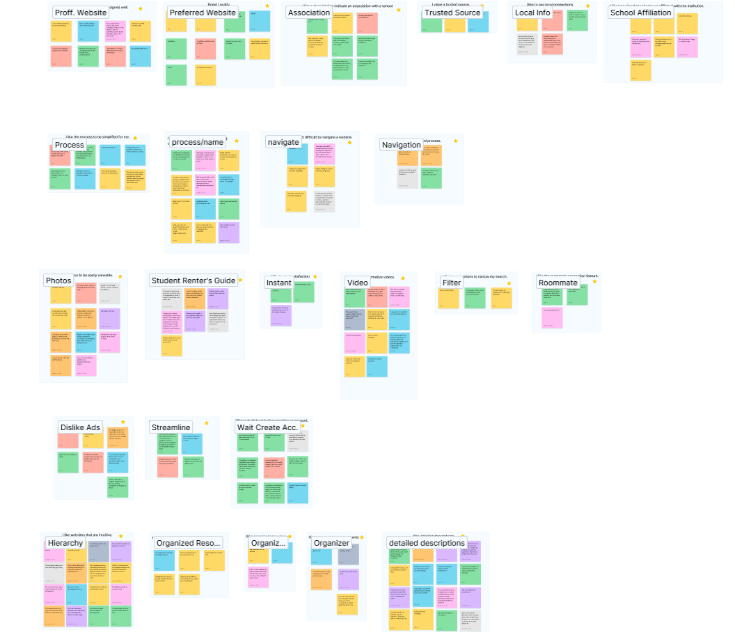
Affinity Map
My team used Affinity Mapping to sort our interview responses. We made sure to put each response in a specific category. Some categories had larger responses so we had to create subcategories for each of the responses.
C & C Analysis
In our Competitive and Comparative Analysis our team came up with six competitors for EDUrain. As a team we worked on conducting a thorough analysis to understand our competitors and what features are similar so that we can incorporate what works for our website redesign.
Define
In this section our team created a Persona, Journey Map, Problem Statement & HMW Statements.
Persona
Our team worked on creating our persona from the information we obtained from our Usability Test and our Questionnaire. We made sure that the insights represented our users especially there pain points when searching for off campus housing.
Journey Map
Our team worked on creating a Journey map of our Persona Alex. We wanted to capture the emotions of our users when searching for off campus apartments. This Journey Map represents the key insights we found while conducting our Usability Test and our Questionnaire.
Problem Statement and HMW
Our team collaborated about different Problem Statements that we wanted to use for our project. In the end we narrowed down to one problem statement that closely aligned with the pain points of college students searching for off campus housing. Also, we drafted several HMW statements to be used for our project. After each statement our team collaborated and voted on the best HMW statement that aligned with our idea that truly best matched how we would redesign EDUrain’s website. Ultimately, we decided to go with two HMW statements that represented what our users wanted.
Design
In this section our team worked on creating sketches, wireframes and a style guide.
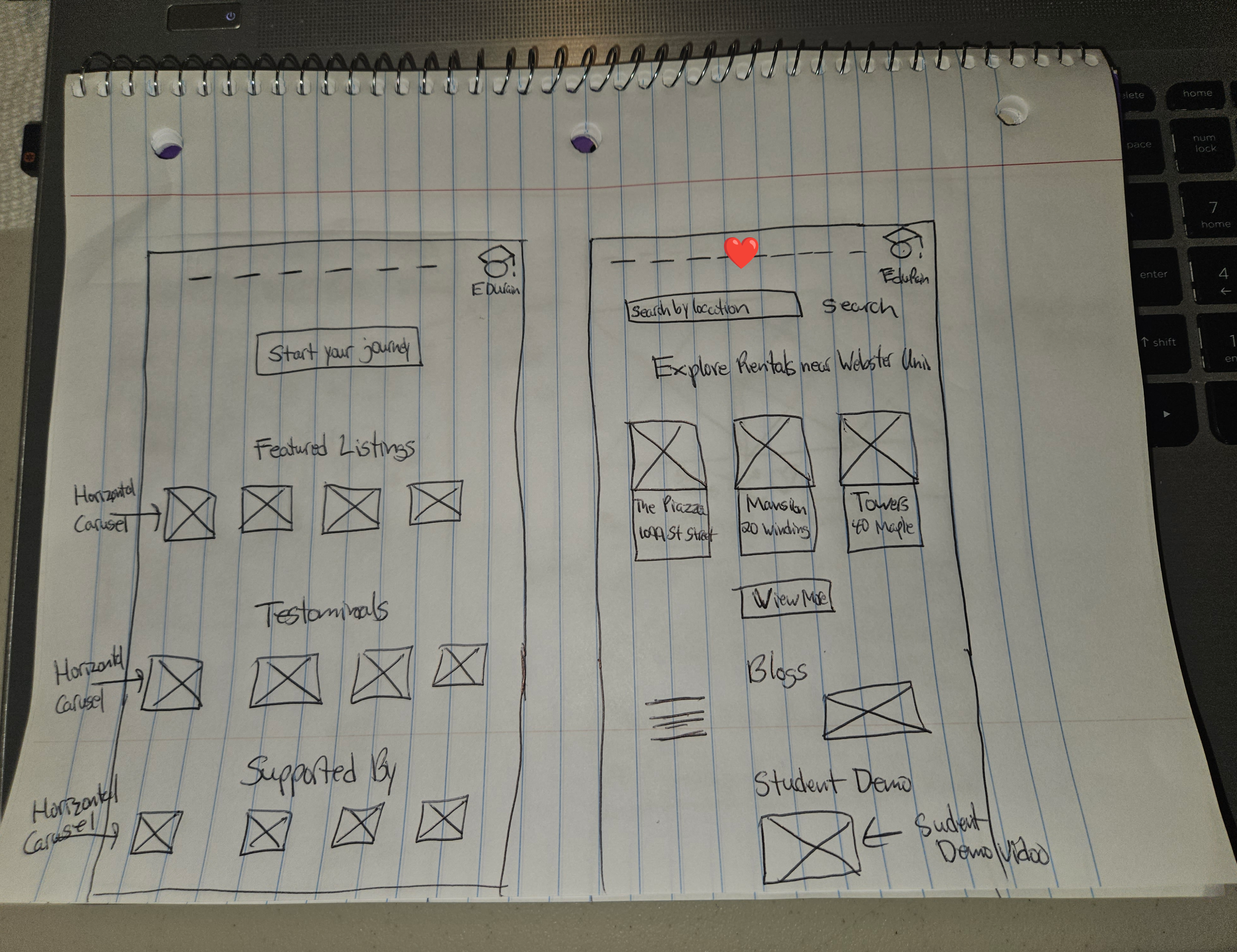
Sketches
As a team we all created Sketches to show how the redesigned website would look like and what features we wanted. From here we reviewed each teammates Sketches and selected the ones which closely aligned with our vision of what our users wanted to make their search easier when looking for off campus apartments.
Below are a few Sketches of how I envisioned the redesigned website of EDUrain would look like.
Wireframes
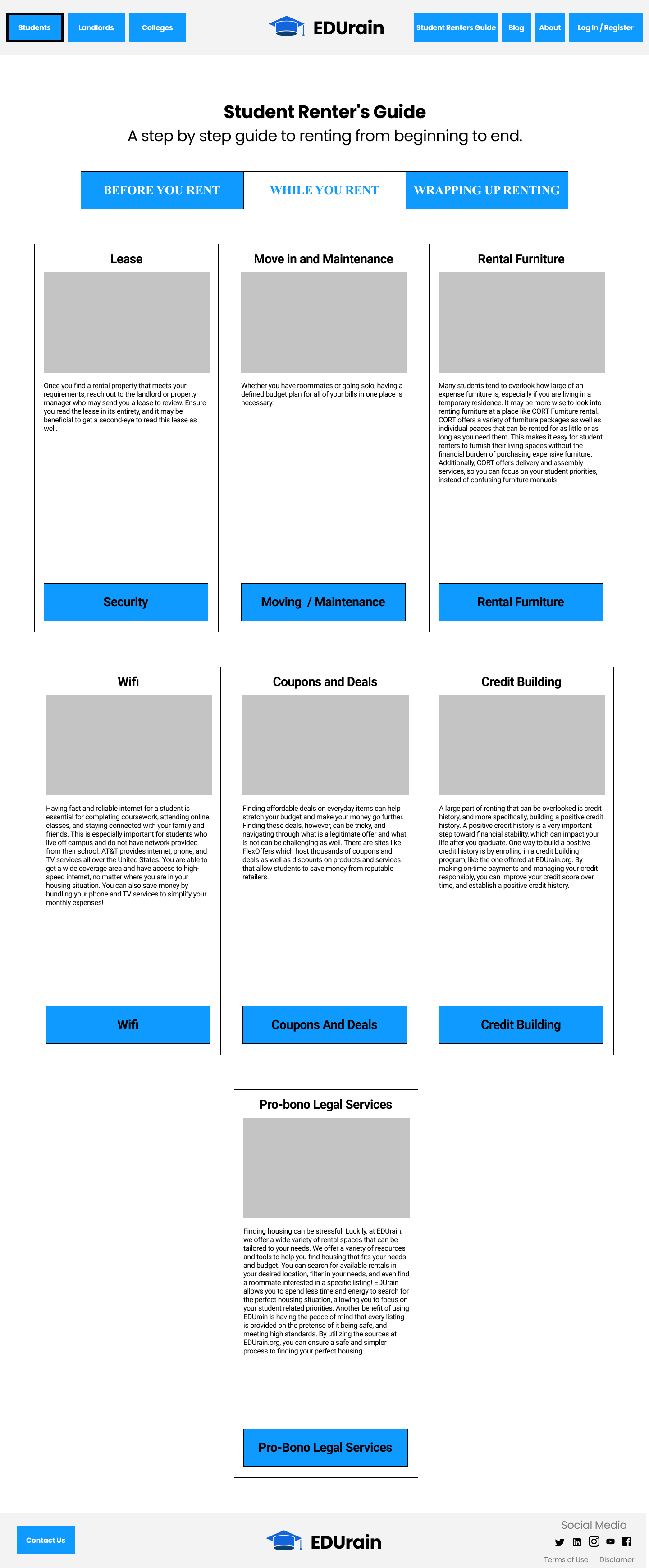
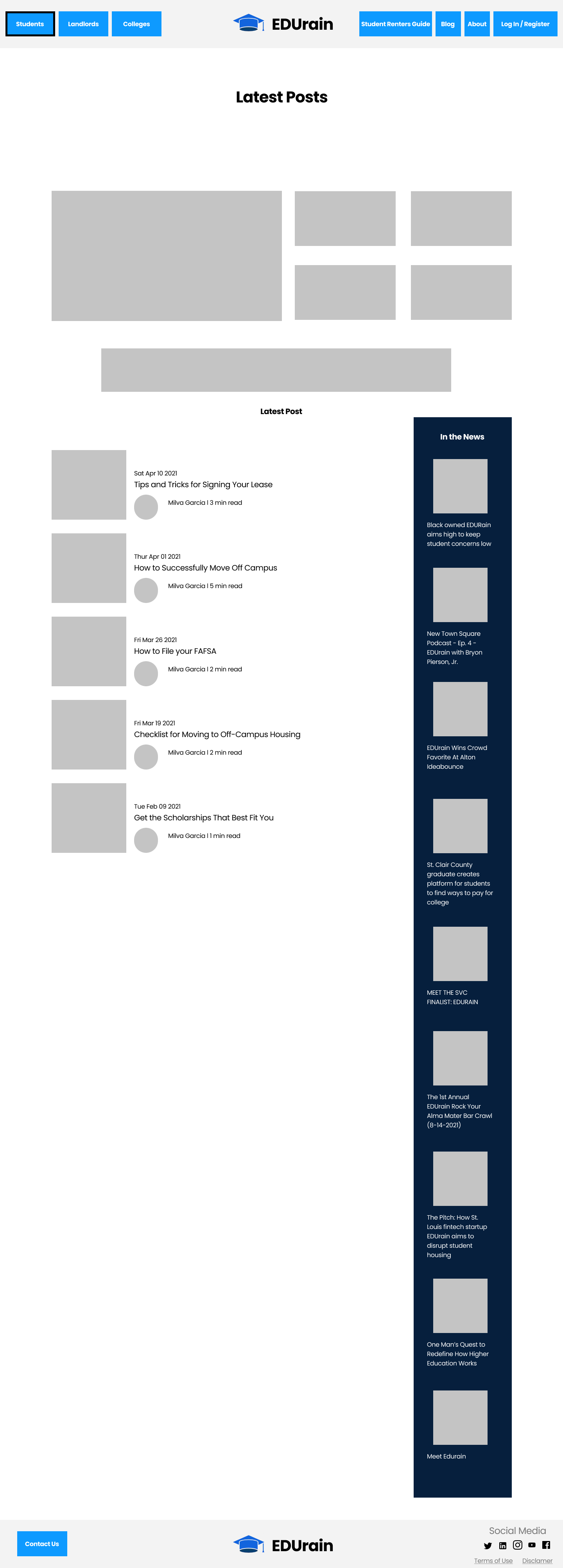
As a team we broke down on creating our wireframes. I worked on creating both Low-Fi and Hi Fi-Wireframes for the About Us page, Student Renters Guide and the Blog section. For the redesigned frames our team made sure to stick with EDUrain’s layout because of the fact that this worked for our users.
Low-Fi Wireframe
Hi-Fi Wireframe
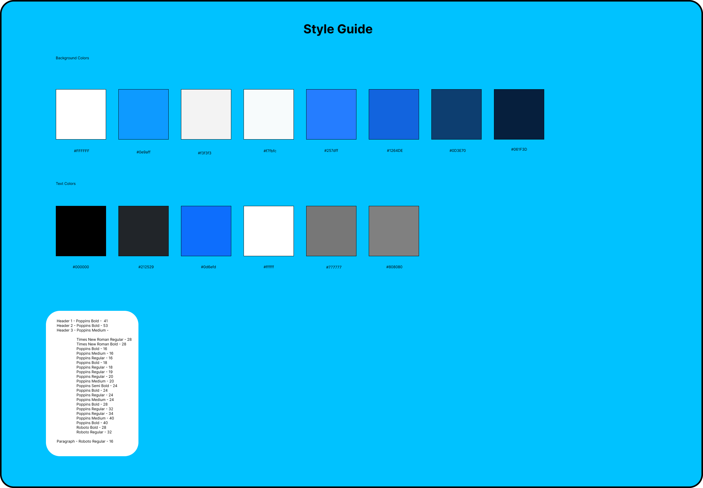
Style Guide
Our client wanted our team to stick with the current style guide of EDUrain’s website since this was not an issue for their users.
Prototype
Our team created a Prototype that addressed our users pain points when searching for off campus apartments on EDUrain’s website. We enhanced the user experience by creating pages on the global navigation bar for students, landlords and universities. Also, we revamped EDUrain’s website for users to find things more easily.
Final Usability Test
Our team conducted a Final Usability Test
Usability Test Takeaways
Found the site to be clear as a first impression
Knew where to go to create an account
Understood what the Students, Landlords & Colleges view meant
Didn't have trouble navigating the site to view an apartment
Deliver
In this stage we will showcase our final Prototype of our redesigned website.


