Project Scope
Client: Lonely Planet
Tine Line: Three Weeks
Overview: Our team redesigned Lonely Planet's mobile app, conducting user research to ensure meaningful features and a user-friendly experience for the Digital Nomad.
My role: I was one of three UX designers in the redesign of the Lonely Planet app. I was involved in every aspect of planning, ideating, and designing across the three weeks. My main responsibilities included user interviews, ideation, usability testing and the final high fidelity wireframe of searching for coffee shops and seeing what options were available in the area.
The Challenge
With the rise of remote work, there has been an increase in the number of digital nomads. LP would like to help digital nomads enjoy their lifestyle more by connecting travel and work. LP would like to understand the traveling needs of digital nomads and design solutions to address them. How can we draw upon the mission of Lonely Planet (of inspiring people to travel) to also meet the needs of digital nomads ?
Brainstorming ideas for next steps
This project was very challenging with the fact that my team struggled at first to understand what a Digital Nomad was and what websites or apps could we learn and get inspiration from since there were not that many. Overall, after discussing this as a group we were able to find resources that gave us more insights to what a Digital Nomad is and resources that gave us inspiration on our app redesign of Lonely Planet.
Discover
Our main goal was to “To understand the traveling needs of Digital Nomads and design solutions to address them”. In this section our team drafted and conducted user interviews, created an Affinity Map from our findings and created a Comparative and Competitive Analysis.
User Interviews
My team created interview questions that we would use for our Digital Nomads interview. Each team member had to create 7 - 10 interview questions that would be reviewed by the team. After the questions were created the team reviewed each of the questions and looked to see what questions more aligned with understanding more of a Digital Nomad. From here each team team member had to conduct one interview each. Who ever we interviewed first had to meet the criteria of a Digital Nomad which is someone that travels and works remotely for months at at time.
Affinity Map
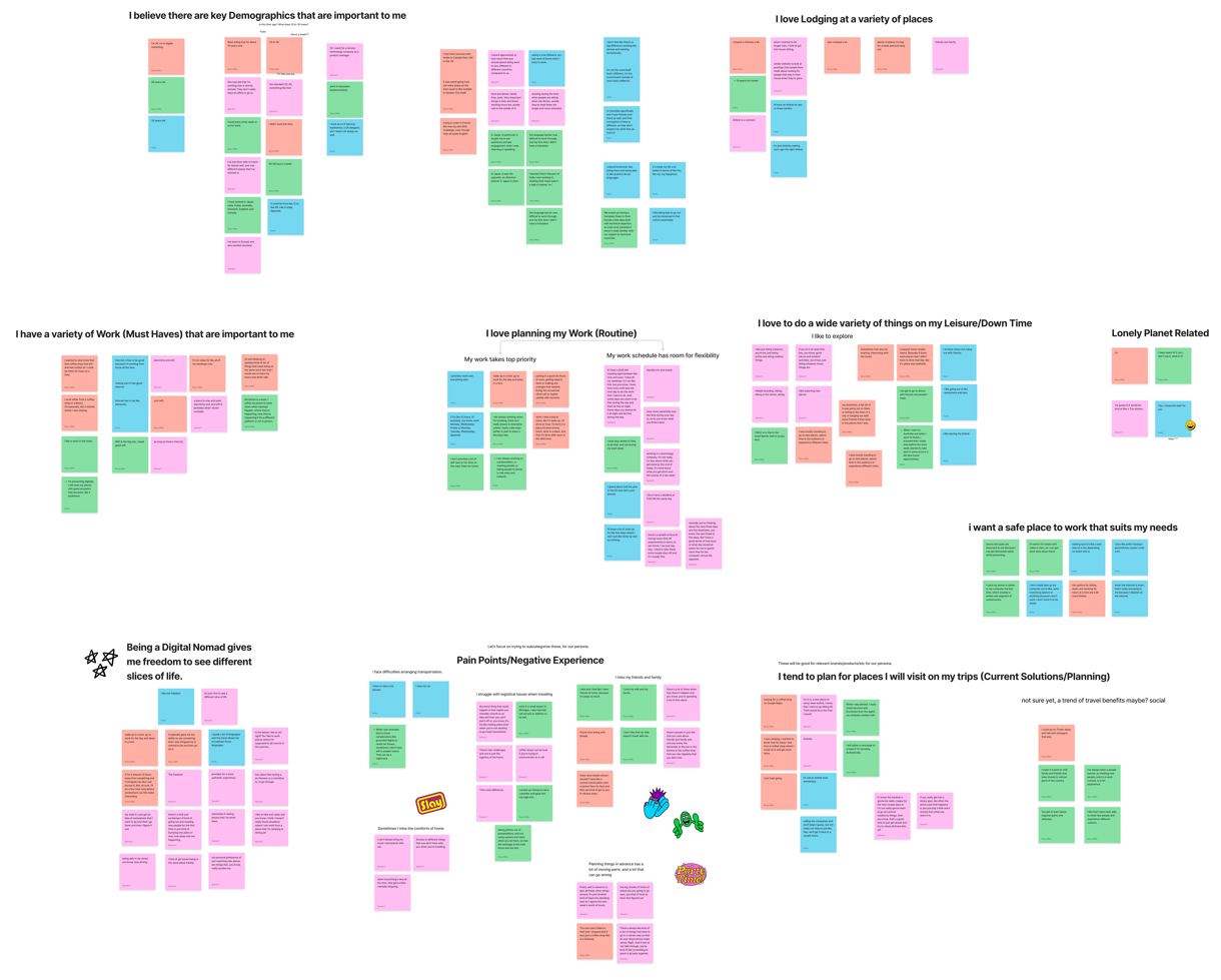
My team used Affinity Mapping to sort our interview responses that was coded using Dovetail which is a research tool that transcribes audio and video recordings of interviews and allows users to make categories of various responses by “coding”. We made sure to put each response in a specific category. Some categories had larger responses so we had to create subcategories for each of the responses.
C & C Analysis
In our Competitive and Comparative Analysis our team came up with six competitors for Lonely Planet. This was a very difficult task since the app that we wanted to redesign was very unique. As a team we worked on conducting a thorough analysis to understand our competitors and what features are similar so that we can incorporate what works for our app redesign.
Define
In this section our team created a Persona, Journey Map, Problem Statement & HMW Statements.
Persona
Our team worked together to brainstorm ideas that we thought would be beneficial in designing our Persona and what we wanted to include that represented our users experiences and pain points as a Digital Nomad.
Journey Map
Our team worked on creating a Journey map of our Persona Jordan. We wanted our user journey to reflect the life of a Digital Nomad that captures the people that we interviewed in addressing there pain points.
Problem Statement and HMW
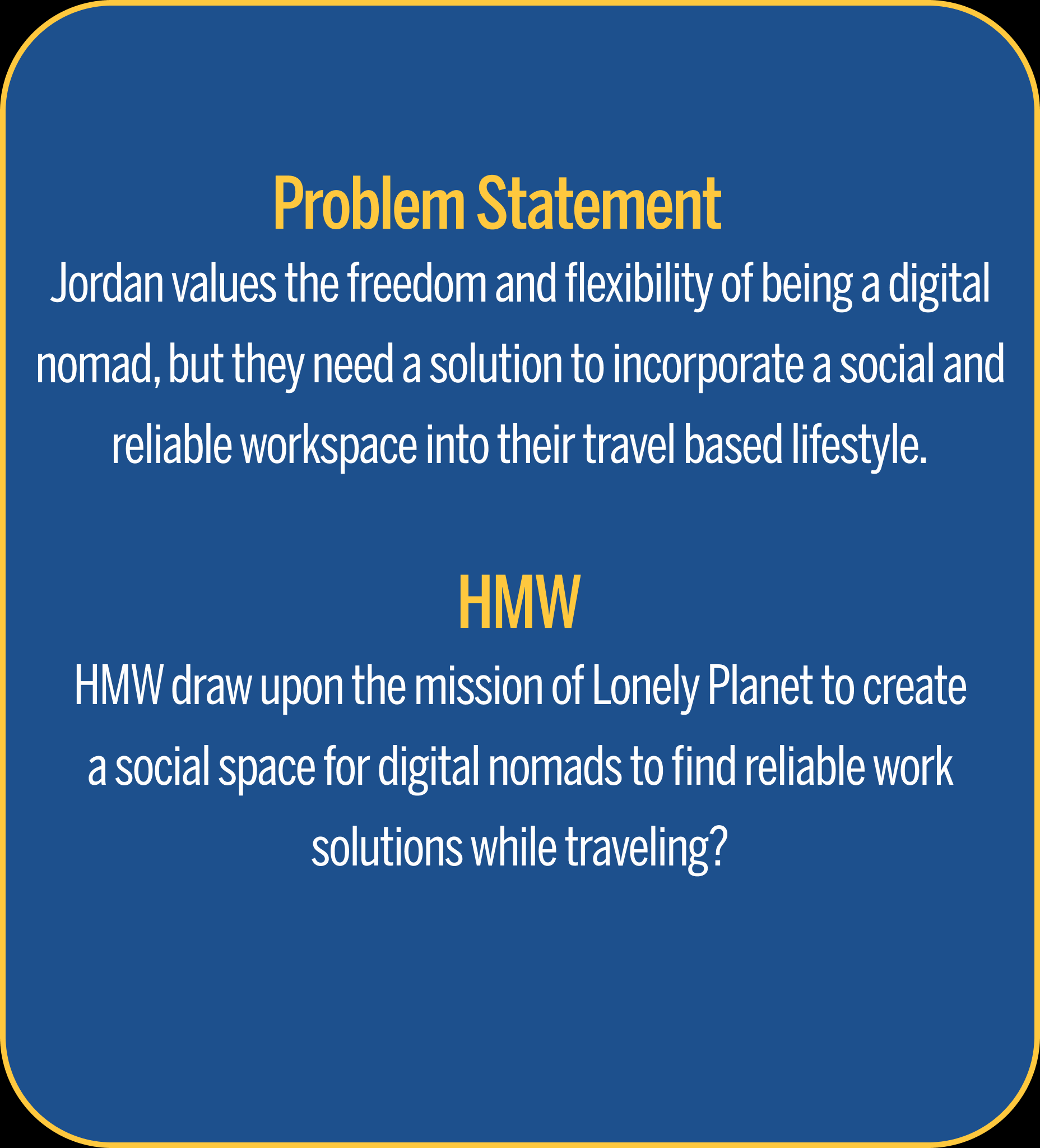
Our team collaborated about different Problem Statements that we wanted to use for our project. In the end we narrowed down to one problem statement that closely aligned with the pain points of a Digital Nomad. Also, we drafted several HMW statements to be used for our project. After each statement our team collaborated and voted on the best HMW statement that aligned with our idea that truly best matched how we would redesign Lonely Planets website.
Design
In this section our team worked on creating sketches, wireframes and a style guide.
Sketches
As a team we all created Sketches to show how we wanted to design our app and what features we wanted to work on. From here we reviewed each teammates Sketches and tried to select which ones more closely aligned with our vision in redesigning Lonely Planet.
Here is my Sketch of how I envisioned the Lonely Planet app should look like.
Wireframes
As a team we broke down on creating our wireframes. I worked on creating a Hi Fi-Wireframe that showed on one frame typing in coffee shops on the top navigation search and a second frame showing the results of coffee shops in the area including the names, distances from each other and star ratings.
Low-Fi Wireframe
Hi-Fi Wireframe
Wireframe that I created for our team
Style Guide
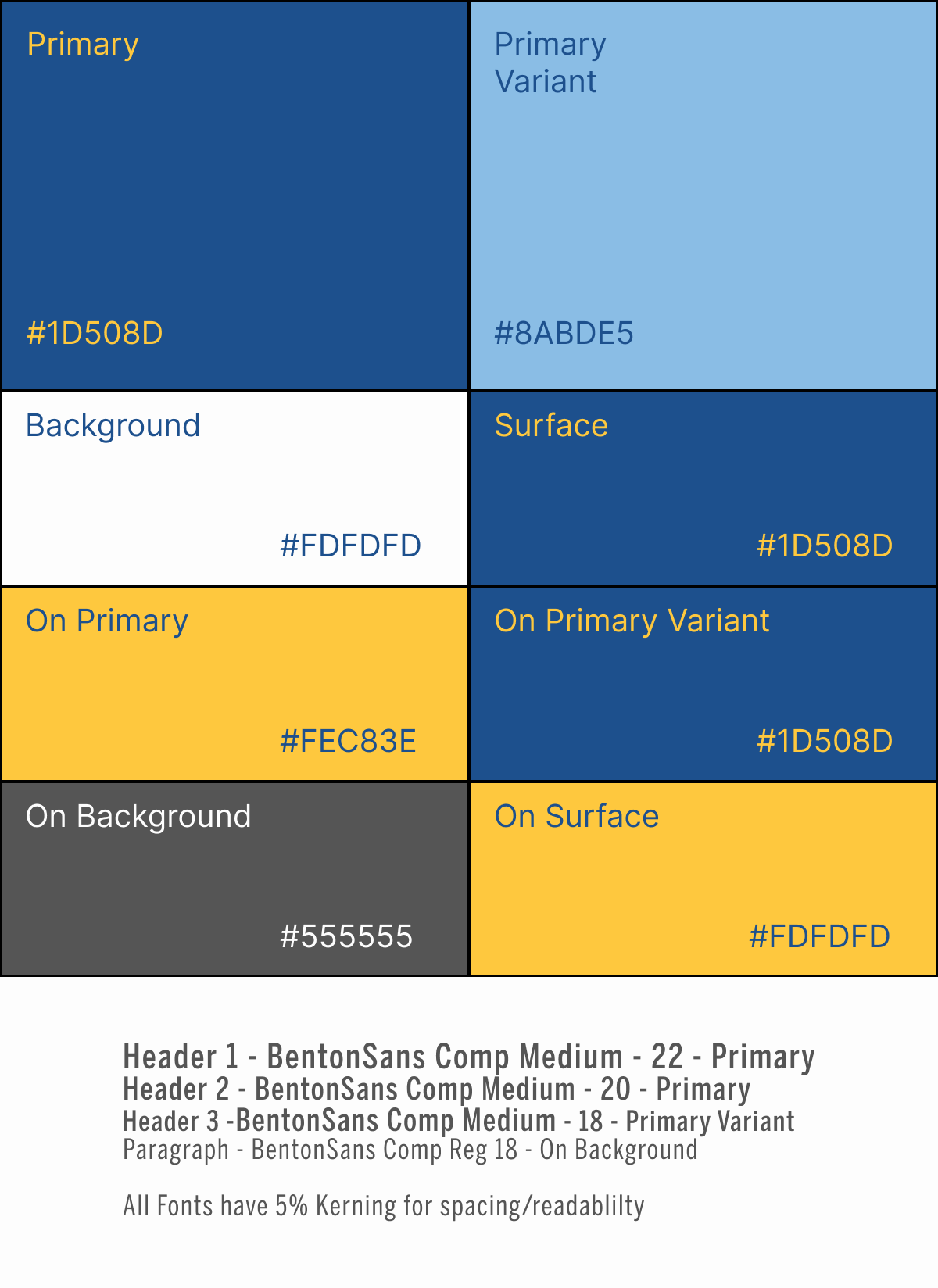
As team, we decided to follow the Lonely Planet style guide in order to stay with the branding style that the company currently has. Throughout the design process, we also made sure that the color combinations within these color combinations are accessible and complies with WCAG standards. Figma plugin such as Contrast Checker & Contrast, were utilized to assist with this process.
Prototype
Our team created a Prototype that captured what our interviewees wanted while traveling as a Digital Nomad. In our Prototype we created an app version of Lonely Planet that helped Digital Nomads find coffee shops, restaurants and locate work spaces that provided coffee, food, wi-fi and outlets to plug devices.
Usability Test
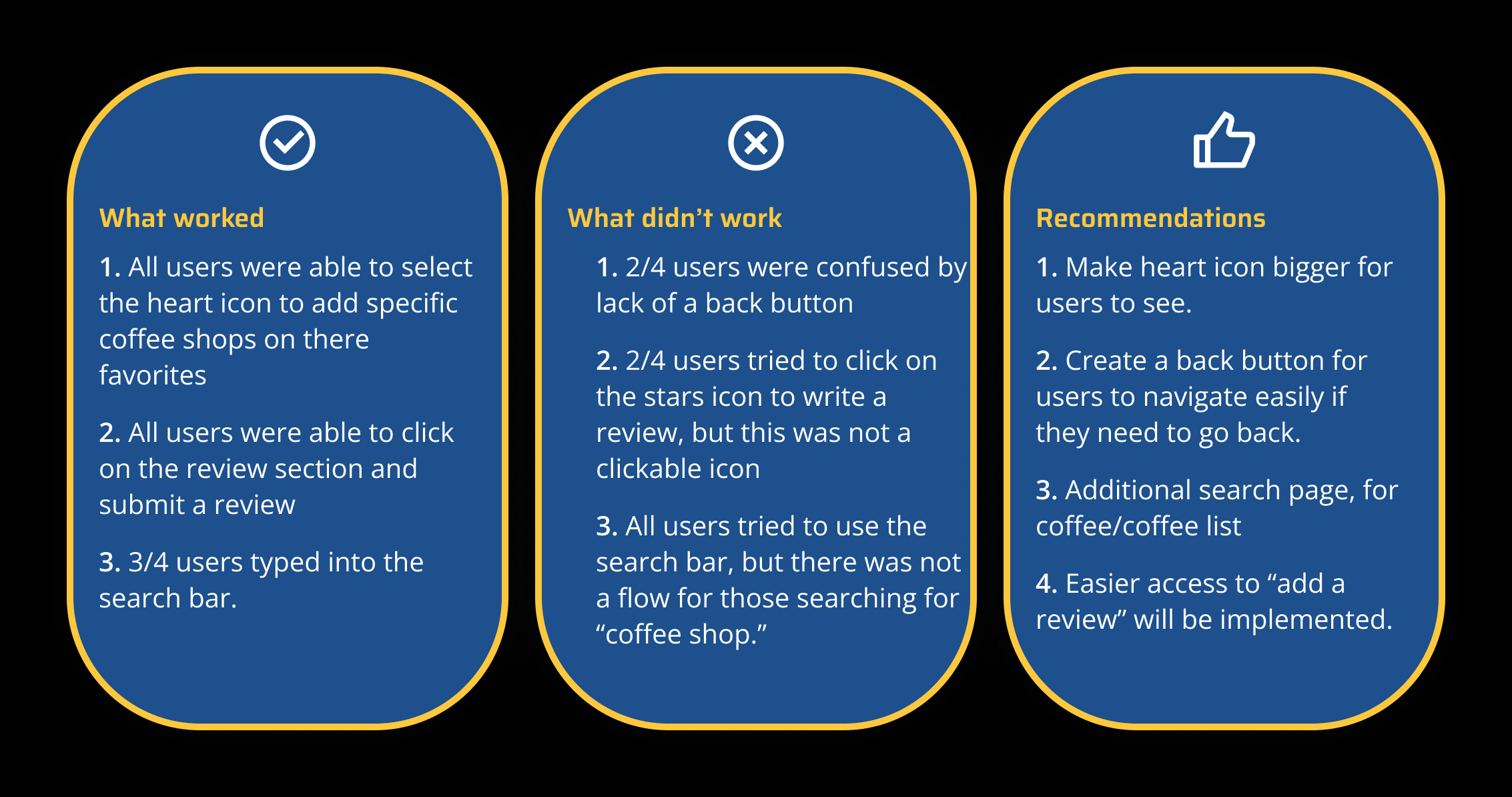
Our team conducted a Usability Test to see if there were any issues with our prototype. From our testing we learned that all were able to complete three tasks successfully. 75% of our users were able to locate a 5 star coffee shop that provided coffee, food, wifi and power. 50% of our users were able to locate the favorites page.
Usability Test Takeaways
Our team agreed to redesign the Lonely Planet app to make the heart icon bigger for users to favorite restaurants, coffee shops and work locations that they liked easily. Also, we implemented to create a back button for users to go back more easily as well as created an additional search page that listed the available coffee shops. Finally, one last thing that we implemented was that we created a review section on the product card so users were able to click the star icon and then be able to write a review more easily.
Deliver
In this stage we will showcase our final Prototype


